theme_boers <- function(){
theme(text=element_text(family="Corbel", colour="black"),
      #define font
      plot.margin = margin(0.2,1,0,0,"cm"),
      #prevent x axis labels from being cut off
      plot.title = element_text(size=20),
      #text size of the title
      panel.grid.major = element_blank(),
      panel.grid.minor = element_blank(),
      #we do not want automatic grid lines in the background
      axis.text.x=element_text(size=20, colour="black"),
      axis.text.y=element_text(size=20, colour="black"),
      axis.title.x = element_text(size=20),
      axis.title.y = element_text(size=20),
      #define the size of the tick labels and axis titles
      axis.line = element_line(colour = 'black', linewidth = 0.25),
      axis.ticks = element_line(colour = "black", linewidth = 0.25),
      #specify thin axes
      axis.ticks.length = unit(5, "pt"),
      axis.minor.ticks.length = unit(2.5, "pt"))
  #minor ticks should be shorter than major ticks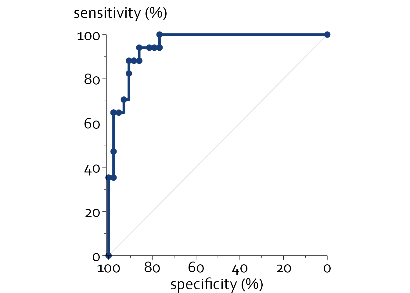
}Diagnostic studies and ROC curves
Receiver-Operator Characteristic (ROC) curves are frequently used in diagnostic studies to show the sensitivity and specificity of a diagnostic test across all possible cutoff values. The area under the ROC curve (AUC) is a global measure of discriminative performance that ranges from 0.5 to 1.0, with higher values indicating a higher discriminative performance for distinguishing between participants with and without a certain outcome.
Caveats of ROC curves and the AUC
Two caveats should be considered
1
Hond AAH de, Steyerberg EW, Calster B van. Interpreting area under the receiver operating characteristic curve. The Lancet Digital Health 2022; 4: e853–5.
2
Collins GS, Moons KGM, Dhiman P, et al. TRIPOD+AI statement: updated guidance for reporting clinical prediction models that use regression or machine learning methods. BMJ 2024; : e078378.
3
Hartman N, Kim S, He K, Kalbfleisch JD. Pitfalls of the concordance index for survival outcomes. Statistics in Medicine 2023; 42: 2179–90.
4
Van Calster B, McLernon DJ, Smeden M van, Wynants L, Steyerberg EW. Calibration: the Achilles heel of predictive analytics. BMC Medicine 2019; 17. DOI:10.1186/s12916-019-1466-7.
5
Vickers AJ, Elkin EB. Decision Curve Analysis: A Novel Method for Evaluating Prediction Models. Medical Decision Making 2006; 26: 565–74.
6
Fitzgerald M, Saville BR, Lewis RJ. Decision Curve Analysis. JAMA 2015; 313: 409.
7
Vickers AJ, Calster B van, Steyerberg EW. A simple, step-by-step guide to interpreting decision curve analysis. Diagnostic and Prognostic Research 2019; 3. DOI:10.1186/s41512-019-0064-7.
8
Vickers AJ, Van Calster B, Steyerberg EW. Net benefit approaches to the evaluation of prediction models, molecular markers, and diagnostic tests. BMJ 2016; : i6.
For this chapter, we will assume the data to plot the ROC curve are already available (e.g., after calling pROC::roc).
Technically, the ROC curve is a simple line graph, but with a step function.
We will first load the data set that we’ll be using.
library(ggplot2)
library(readxl)

boers <- read_excel("Data/boers.xlsx", sheet = "roc (27)")
boers$x <- boers$`1-spec`
#the x axis position is 1 minus specificity
boers$y <- boers$Sens

knitr::kable(head(boers, n=5))| 1-spec | Sens | x | y |
|---|---|---|---|
| 0.0 | 0.0 | 0.0 | 0.0 |
| 0.0 | 35.3 | 0.0 | 35.3 |
| 0.0 | 35.3 | 0.0 | 35.3 |
| 2.3 | 35.3 | 2.3 | 35.3 |
| 2.3 | 47.1 | 2.3 | 47.1 |
ggplot(data=boers, aes(x, y)) + theme_minimal() + theme_boers() +
    annotate(geom="segment", x=0, xend=100, y=0,
             yend=100, col="#E3E4E5") +
   coord_cartesian(xlim=c(-1,100), ylim=c(0,100), clip = "off") + #x offset
  geom_step(linewidth=1.5, colour="#183e7a") +
  geom_point(size=3, colour="#183e7a") +
  scale_color_identity() +
  scale_y_continuous(breaks=seq(0,100,by=20),
                       labels=seq(0,100,by=20),
                       minor_breaks = seq(0,100,by=10),
                       expand = c(0,0)) +
  scale_x_continuous(breaks=seq(0,100,by=20),
                       labels=seq(100,0,by=-20),
                     minor_breaks = seq(0,100,by=10),
                       expand = c(0,0)) +
  guides(y = guide_axis(minor.ticks = TRUE), x=guide_axis(minor.ticks = TRUE)) +
  theme(plot.margin=margin(1.5,1,0,0,"cm"), aspect.ratio = 1) +
  annotate("text", -16, 110, label="sensitivity (%)", size=20/.pt, hjust=0, family="Corbel") +
  xlab("specificity (%)") + ylab("")