Introduction to data visualization in R
This chapter will introduce the ggplot theme that we will use throughout the rest of the book (‘theme_boers’). We will use a simple example to showcase the functionality of this theme.
R packages dedicated to specific topics, such as survival analysis and analysis of diagnostic tests, typically contain at least two types of functions: functions for data analysis and functions for subsequent data visualization. Some packages also have “one-stop-shop” functions which can perform both.
One major problem with relying on the plotting functions of packages is sacrificing control and consistency over your graphs in exchange for (superficial) convenience. Changing even one aspect of your graph might unfold a safari into the reference documentation to discover what the corresponding variable is called. After all, terminology varies widely between packages: the argument for plotting the 95% confidence interval of a survival curve may be called “conf.int”, while the 95% CI of an ROC curve may be called “auc.polygon”, “plotCI”, or simply “ci”; the color of reference lines may be called “col.ideal”, “identity.col”, or “col.ref”, etc.
In the vast majority of cases, the best approach is simply as follows: use R packages to analyze your data, but plot the data yourself using base R or ggplot. Most scientific graphs are simply variations of a small set of graph types. Thus, mastering the basic graphical functions for R allows you to create any graph you want, in any way you want.
The windows contain code, and data tables. When the material is too wide to fit in the window, a horizontal scroll bar allows you to see the rest. In the top-right corner of the coding window, clicking on the clipboard sign copies the code to…the clipboard!
Simple example
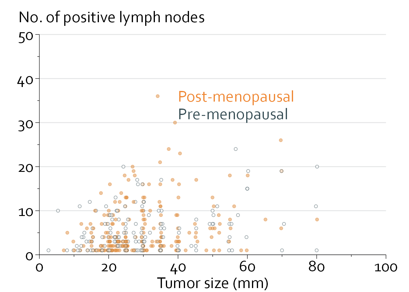
We will start with a simple scatterplot. This example uses data from the phase 3 GBSG trial, which randomized 686 women with primary breast cancer to chemotherapy with vs without hormonal therapy. The aim is to create a simple scatterplot of tumor size (mm) vs the number of positive lymph nodes, for pre- and postmenopausal women separately.
First, we will plot the data in base R.
library(survival)
gbsg <- survival::gbsg
gbsg <- gbsg[,c("meno", "size", "nodes")]
knitr::kable(head(gbsg, n=10))| meno | size | nodes |
|---|---|---|
| 0 | 18 | 2 |
| 1 | 20 | 16 |
| 1 | 40 | 3 |
| 0 | 25 | 1 |
| 1 | 30 | 5 |
| 0 | 52 | 11 |
| 0 | 21 | 8 |
| 0 | 20 | 9 |
| 1 | 20 | 1 |
| 0 | 30 | 1 |
gbsg$dot_col <- with(gbsg, ifelse(meno==1, "#df8f44", "#374e55"))
gbsg$fill_col <- with(gbsg, ifelse(meno==1, "#df8f44", "white"))
gbsg <- subset(gbsg, size<=100 & nodes<=50)
gbsg <- gbsg[1:400,]

with(gbsg, plot(size, nodes, col=dot_col))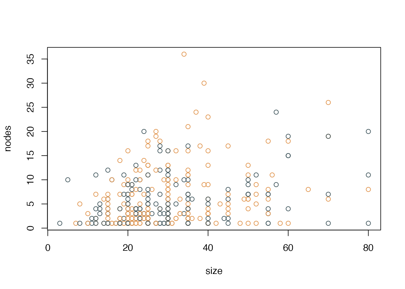
In base R, we see the following issues:
- Y axis labels are vertical instead of horizontal
- Vertical y axis title
- There is a box around the entire plot area
- A slight offset in the x and y axis (i.e., they don’t start at exactly x=0 and y=0)
- There are no minor ticks at, e.g., x=5, 10, 15… 80
- This graph could benefit from some light horizontal grid lines y=10, 20, 30, 40, and 50
We will now switch over to ggplot (for which we need to load the ggplot2 library).
library(ggplot2)
ggplot(data=gbsg, aes(x=size, y=nodes, colour=meno)) + geom_point() 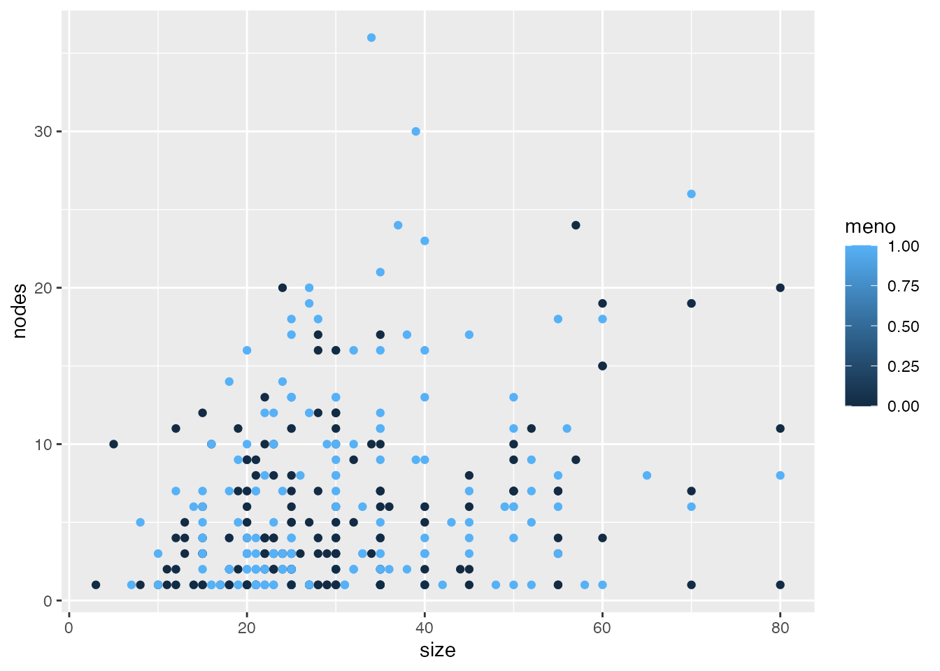
In ggplot, we see the following issues:
- Grey background with a white grid/overcheck
- Slight axis offset
- Axis titles and labels are quite small
- The color scale is meaningless, as meno is a binary variable with no values between 0 and 1
- There is no ‘real’ x and y axis
We will now improve this graph step by step. First, we will specify our own colours (dot_col variable).
gg <- ggplot(data=gbsg, aes(x=size, y=nodes, colour=dot_col)) + geom_point()
gg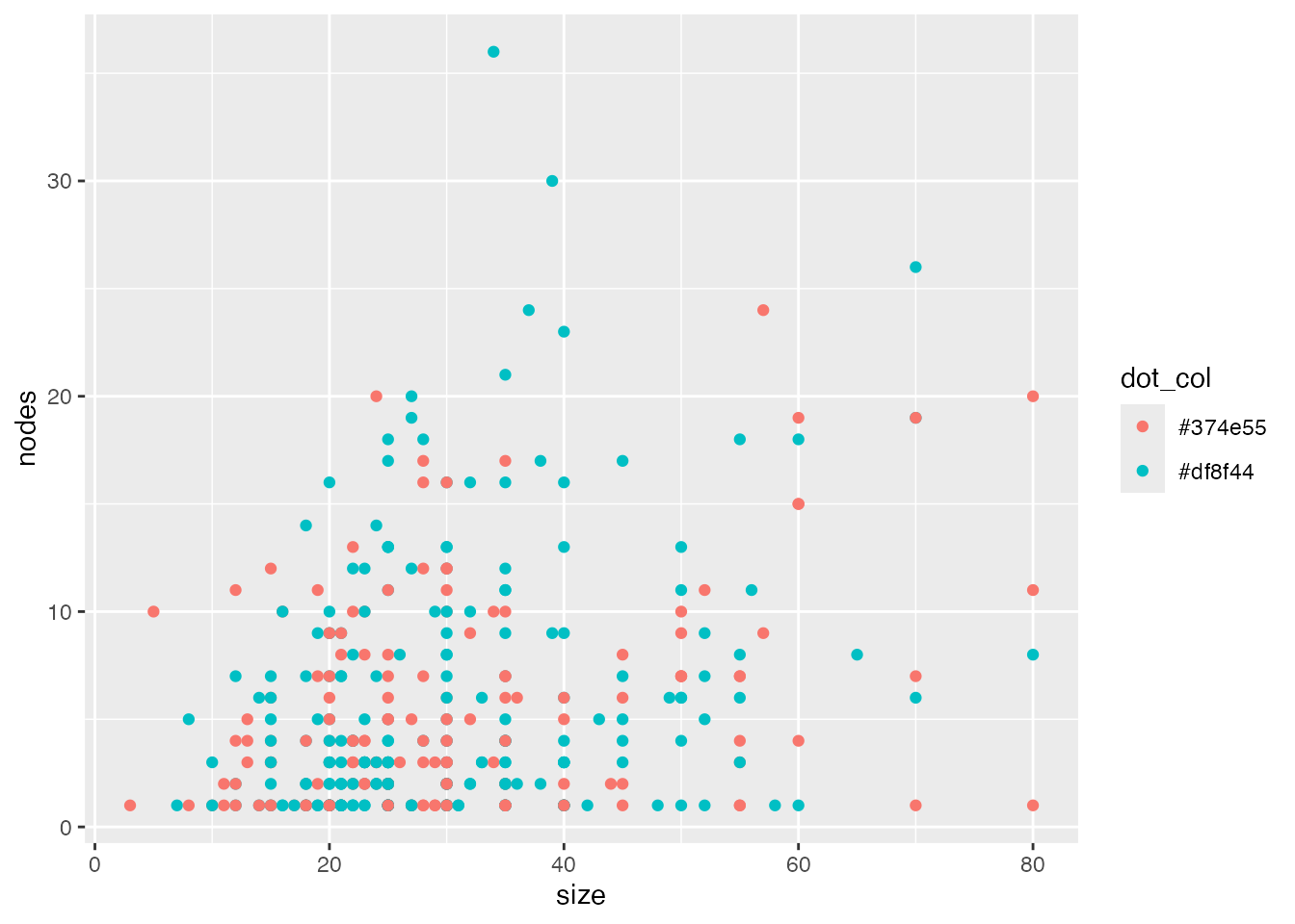
Note that ggplot ignores our specified color for now, and uses its own color scheme. We will change this later.
Next, we’ll make the background white using ggplot’s theme_minimal() function.
gg2 <- gg + theme_minimal()
gg2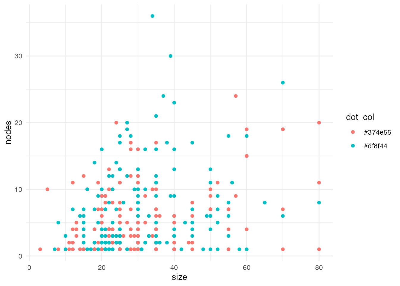
We will remove the grey grid lines in the background.
gg3 <- gg2 + theme_minimal() + theme(panel.grid.major = element_blank(),
      panel.grid.minor = element_blank())
gg3
Note that the axes have disappeared. However, let’s first continue by changing the text size and font.
gg4 <- gg3 + theme(text=element_text(family="Corbel", colour="black"),
      plot.title = element_text(size=20),
      axis.text.x=element_text(size=20, colour="black"),
      axis.text.y=element_text(size=20, colour="black"),
      axis.title.x = element_text(size=20),
      axis.title.y = element_text(size=20))
gg4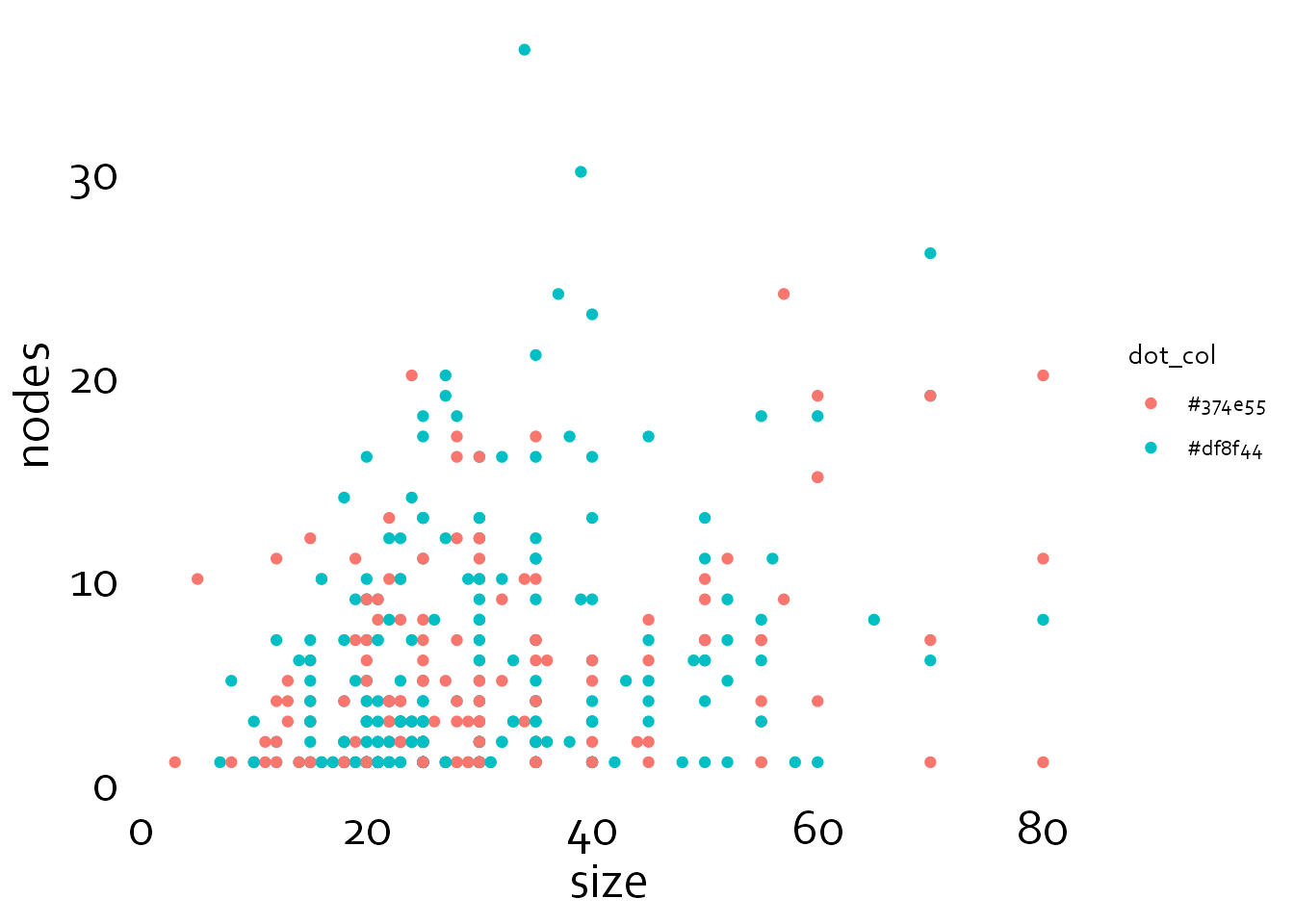
Now, we will specify the thickness of the axes and ticks (erring on the thin side), and the size of the major and minor ticks. Note that the minor ticks are half as long as the major ticks.
gg5 <- gg4 + theme(axis.line = element_line(colour = 'black', linewidth = 0.25),
      axis.ticks = element_line(colour = "black", linewidth = 0.25),
      axis.ticks.length = unit(4, "pt"),
      axis.minor.ticks.length = unit(2, "pt"))
gg5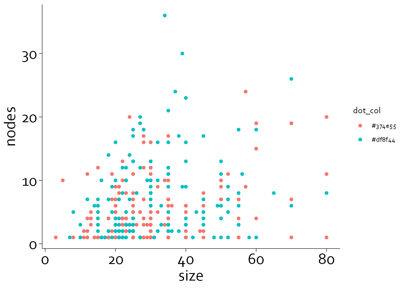
The graph is almost finished, but we still need to correct the axes (no offset), add some background lines, and change the color of the dots.
An offset would have been handy if there are patients with a tumour size of 0 and/or no positive lymph nodes. Without an offset, points would get plotted directly on the axes.
First, we will set the x and y axis limits with coord_cartesian(), and allow data to fall outside this area (clip=“off”).
gg6 <- gg5 + coord_cartesian(xlim=c(0,100), ylim=c(0,50), clip = "off")
gg6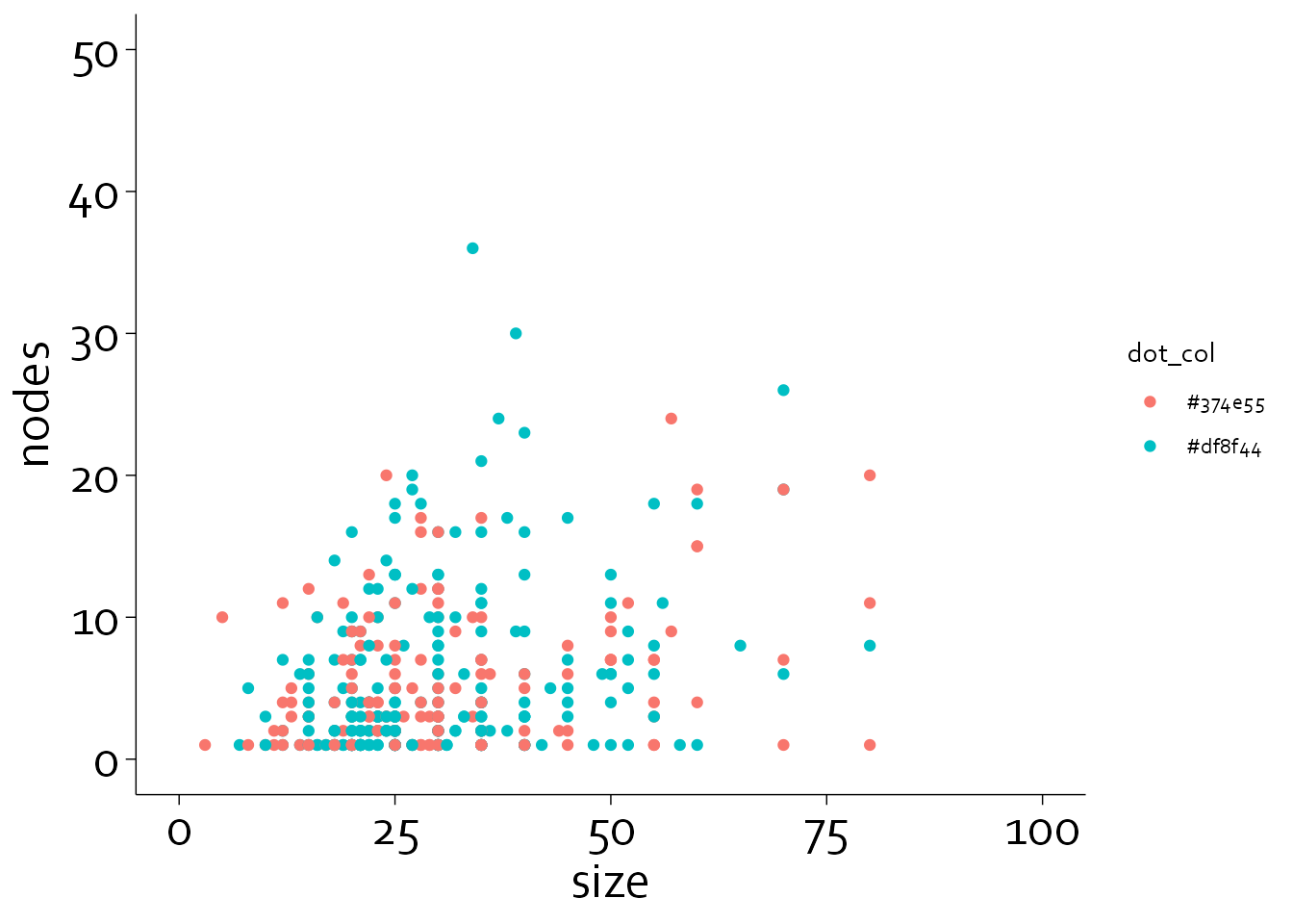
Let’s now adjust the x and y axes. We can specify major ticks (‘breaks’), axis labels (‘labels’), minor breaks (‘minor_breaks’) and specify that we do not want an offset (‘expand=c(0,0)’).
gg7 <- gg6 + scale_x_continuous(breaks=seq(0,100,by=20),
                     labels=seq(0,100,by=20),
                     minor_breaks = seq(0,100,by=10),
                     expand = c(0,0)) +
    scale_y_continuous(breaks=seq(0,50,by=10),
                     labels=seq(0,50,by=10),
                     minor_breaks = seq(0,50,by=5),
                     expand = c(0,0))
gg7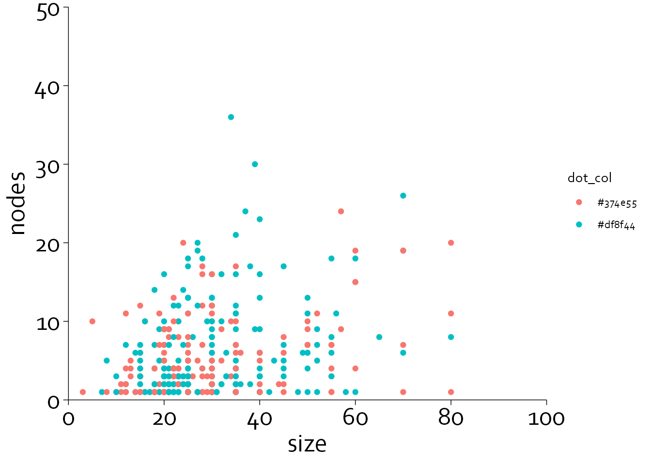
Note that the minor axis ticks did not get plotted. To do this, you need to specify guide_axis(minor.ticks=TRUE).
gg8 <- gg7 + guides(x = guide_axis(minor.ticks = TRUE),
    y = guide_axis(minor.ticks = TRUE))

gg8
Next, we will define some grey background lines and specify the color that needs to be used. In addition, we will use horizontal y axis labels instead of vertical labels.
gg9 <- gg8 +
  annotate(geom="segment", x=0, xend=100, y=seq(0,50,by=10), yend=seq(0,50,by=10),
           col="#E3E4E5") +
  scale_colour_identity() +
  xlab("Tumor size (mm)") + ylab("") + labs(title="No. of positive lymph nodes")
gg9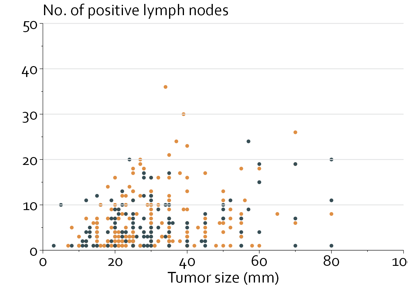
Two final issues remain: points are overlapping, and the grid lines are plotted on top of the data (simply because we first use geom_point and afterwards plot the background lines).
To solve this, we will (1) add some random variation in the data to create ‘horizontal dithering’ to reduce overlap, (2) make colors partially translucent, and (3) recreate the plot and draw the grid lines first.
However, we will start by defining the theme_boers(), so we can use the same setting for other graphs as well.
theme_boers <- function(){
theme(text=element_text(family="Corbel", colour="black"),
      #define font
      plot.margin = margin(1.5,1,0,0,"cm"),
      #prevent y and x axis labels from being cut off
      plot.title = element_text(size=20),
      #text size of the title
      panel.grid.major = element_blank(),
      panel.grid.minor = element_blank(),
      #we do not want automatic grid lines in the background
      axis.text.x=element_text(size=20, colour="black"),
      axis.text.y=element_text(size=20, colour="black"),
      axis.title.x = element_text(size=20),
      axis.title.y = element_text(size=20),
      #define the size of the tick labels and axis titles
      axis.line = element_line(colour = 'black', linewidth = 0.25),
      axis.ticks = element_line(colour = "black", linewidth = 0.25),
      #specify thin axes
      axis.ticks.length = unit(5, "pt"),
      axis.minor.ticks.length = unit(2.5, "pt"))
  #minor ticks should be half the length of major ticks
}gbsg$size_new <- gbsg$size + rnorm(n=nrow(gbsg), mean=0, sd=0.3)
#scatter the x position slightly
ggplot(data=gbsg, aes(x=size_new, y=nodes, colour=dot_col, fill=fill_col)) +
theme_minimal() + theme_boers() +
annotate(geom="segment", x=0, xend=100, y=seq(0,50,by=10), yend=seq(0,50,by=10),
col="#E3E4E5") +
coord_cartesian(xlim=c(0,100), ylim=c(0,50), clip = "off") +
scale_x_continuous(breaks=seq(0,100,by=20),
labels=seq(0,100,by=20),
minor_breaks = seq(0,100,by=10),
expand = c(0,0)) +
scale_y_continuous(breaks=seq(0,50,by=10),
labels=seq(0,50,by=10),
minor_breaks = seq(0,50,by=5),
expand = c(0,0)) +
guides(x = guide_axis(minor.ticks = TRUE),
y = guide_axis(minor.ticks = TRUE)) +
scale_colour_identity() + scale_fill_identity() +
geom_point(shape=21, alpha=0.5) +
annotate("text", x=40, y=36, label="Post-menopausal",
colour="#EF8733", hjust=0, size=20/.pt, family="Corbel") +
annotate("text", x=40, y=32, label="Pre-menopausal",
colour="#374e55", hjust=0, size=20/.pt, family="Corbel") +
annotate("text", x=-6, y=54, label="No. of positive lymph nodes",
hjust=0, size=20/.pt, family="Corbel") +
xlab("Tumor size (mm)") + ylab("")