Time series and line graphs
In this chapter, we will focus on time series graphs, which depict changes in a variable over time. We will also deal with survival (c.q. Kaplan-Meier) graphs and ROC curves.
Line graph
The dataset provided features the mean, standard deviation and sample size at each timepoint.
library(ggplot2)
library(readxl)
library(DescTools)
line_data <- read_excel("Data/boers.xlsx", sheet = "line + null zone new")

line_data$common_mean <- with(line_data, (placebo_mean+tcz_mean)/2)
line_data$null_lci <- with(line_data, common_mean - 0.25*abs((diff_uci-diff_lci)))
line_data$null_uci <- with(line_data, common_mean + 0.25*abs((diff_uci-diff_lci)))

knitr::kable(head(line_data, n=5))| time | placebo_mean | placebo_sd | placebo_lci | placebo_uci | placebo_n | tcz_mean | tcz_sd | tcz_lci | tcz_uci | tcz_n | diff | diff_lci | diff_uci | common_mean | null_lci | null_uci |
|---|---|---|---|---|---|---|---|---|---|---|---|---|---|---|---|---|
| 3 | -1.450 | 4.577092 | -2.846 | -0.054 | 43 | -1.057 | 4.852363 | -2.611 | 0.497 | 39 | 0.393 | -1.69 | 2.47 | -1.2535 | -2.2935 | -0.2135 |
| 8 | -1.038 | 5.436116 | -2.696 | 0.620 | 43 | -1.908 | 5.791626 | -3.717 | -0.099 | 41 | -0.870 | -3.31 | 1.57 | -1.4730 | -2.6930 | -0.2530 |
| 16 | -2.031 | 6.204627 | -3.969 | -0.093 | 41 | -3.221 | 5.921569 | -5.168 | -1.274 | 37 | -1.190 | -3.93 | 1.55 | -2.6260 | -3.9960 | -1.2560 |
| 24 | -2.071 | 6.713047 | -4.249 | 0.107 | 38 | -4.094 | 7.341894 | -6.508 | -1.680 | 37 | -2.023 | -5.26 | 1.22 | -3.0825 | -4.7025 | -1.4625 |
| 32 | -3.830 | 7.209972 | -6.303 | -1.357 | 34 | -5.089 | 7.493782 | -7.698 | -2.480 | 33 | -1.259 | -4.85 | 2.33 | -4.4595 | -6.2545 | -2.6645 |
theme_boers <- function(){
theme(text=element_text(family="Corbel", colour="black"),
      #define font
      plot.margin = margin(0.2,1,0,0,"cm"),
      #prevent x axis labels from being cut off
      plot.title = element_text(size=20),
      #text size of the title
      panel.grid.major = element_blank(),
      panel.grid.minor = element_blank(),
      #we do not want automatic grid lines in the background
      axis.text.x=element_text(size=20, colour="black"),
      axis.text.y=element_text(size=20, colour="black"),
      axis.title.x = element_text(size=20),
      axis.title.y = element_text(size=20),
      #define the size of the tick labels and axis titles
      axis.line = element_line(colour = 'black', linewidth = 0.25),
      axis.ticks = element_line(colour = "black", linewidth = 0.25),
      #specify thin axes
      axis.ticks.length = unit(4, "pt"),
      axis.minor.ticks.length = unit(2, "pt"))
  #minor ticks should be shorter than major ticks
}ggplot(data=line_data) + theme_minimal() + theme_boers() +
annotate(geom="rect", xmin=48, xmax=100, ymin=-20, ymax=10, fill="#E2E9F0") + #crossover
annotate(geom="segment", x=0, xend=96, y=seq(-15,10,by=5), #background lines
yend=seq(-15,10,by=5), col="#E3E4E5", linewidth=0.5) +
scale_fill_identity() + #use specified colors
scale_color_identity() +
#null zone:
geom_ribbon(aes(x=time, ymin=null_lci, ymax=null_uci, fill="#CCCCCC"), colour=NA) +
#plot placebo data:
geom_line(data=subset(line_data, time<50), aes(x=time, y=placebo_mean),
colour="#EF8733", linewidth=1) + #plot mean over time (first half)
geom_line(data=subset(line_data, time>45), aes(x=time, y=placebo_mean),
colour="#183e7a", linewidth=1) + #plot mean over time (second half)
geom_point(data=subset(line_data, time<=48), aes(x=time, y=placebo_mean), shape=24,
colour="#EF8733", fill="#EF8733", size=3) + #plot points (first half)
geom_segment(data=subset(line_data, time<=48), #plot SD (first half)
aes(x=time, y=placebo_mean, yend=placebo_mean+placebo_sd), colour="#EF8733") +
geom_segment(data=subset(line_data, time>48), #plot SD (second half)
aes(x=time, y=placebo_mean, yend=placebo_mean+placebo_sd), colour="#183e7a") +
geom_segment(data=subset(line_data, time<=48), #plot CI (first half)
aes(x=time-1, xend=time+1, y=placebo_uci), colour="#EF8733") +
geom_segment(data=subset(line_data, time>48), #plot CI (second half)
aes(x=time-1, xend=time+1, y=placebo_uci), colour="#183e7a") +
geom_point(data=subset(line_data, time>48), aes(x=time, y=placebo_mean), shape=24,
colour="#183e7a", fill="#183e7a", size=3) +#plot point (second half)
#plot TCZ data:
geom_line(aes(x=time, y=tcz_mean), colour="#183e7a", linewidth=1) + #plot mean over time
geom_segment(aes(x=time, y=tcz_mean, yend=tcz_mean-tcz_sd), colour="#183e7a") + #plot SD
geom_segment(aes(x=time-1, xend=time+1, y=tcz_lci), colour="#183e7a") +
geom_point(aes(x=time, y=tcz_mean), shape=21, colour="#183e7a", fill="#183e7a", size=3) +
#specify axes and titles
coord_cartesian(xlim=c(0,100), ylim=c(-20,10), clip = "off") +
#specify range of x and y
scale_y_continuous(breaks=seq(-20, 10,by=5),
labels=c("–20","","–10","","0","","10"),
minor_breaks = seq(-20,10,by=1),
expand = c(0,0)) +
scale_x_continuous(breaks=seq(0,96,by=16),
labels=seq(0,96,by=16),
minor_breaks = seq(0,96,by=8),
expand = c(0,0)) +
annotate("text", x=48, y=-18, label="week", size=20/.pt, family="Corbel") +
annotate("text", x=8, y=-14, label="TCZ",
colour="#183e7a", hjust=0, size=20/.pt, family="Corbel") +
annotate("text", x=8, y=6, label="placebo",
colour="#EF8733", hjust=0, size=20/.pt, family="Corbel") +
annotate("text", x=64, y=6, label="open-label TCZ",
colour="#183e7a", hjust=0, size=20/.pt, family="Corbel") +
annotate("text", -5, 12, label="change in modified Rodnan skin score",
size=20/.pt, hjust=0, family="Corbel") +
guides(y = guide_axis(minor.ticks = TRUE), x = guide_axis(minor.ticks = TRUE)) +
xlab("") + ylab("") +
theme(plot.margin=margin(1.2,1,0,0,"cm"))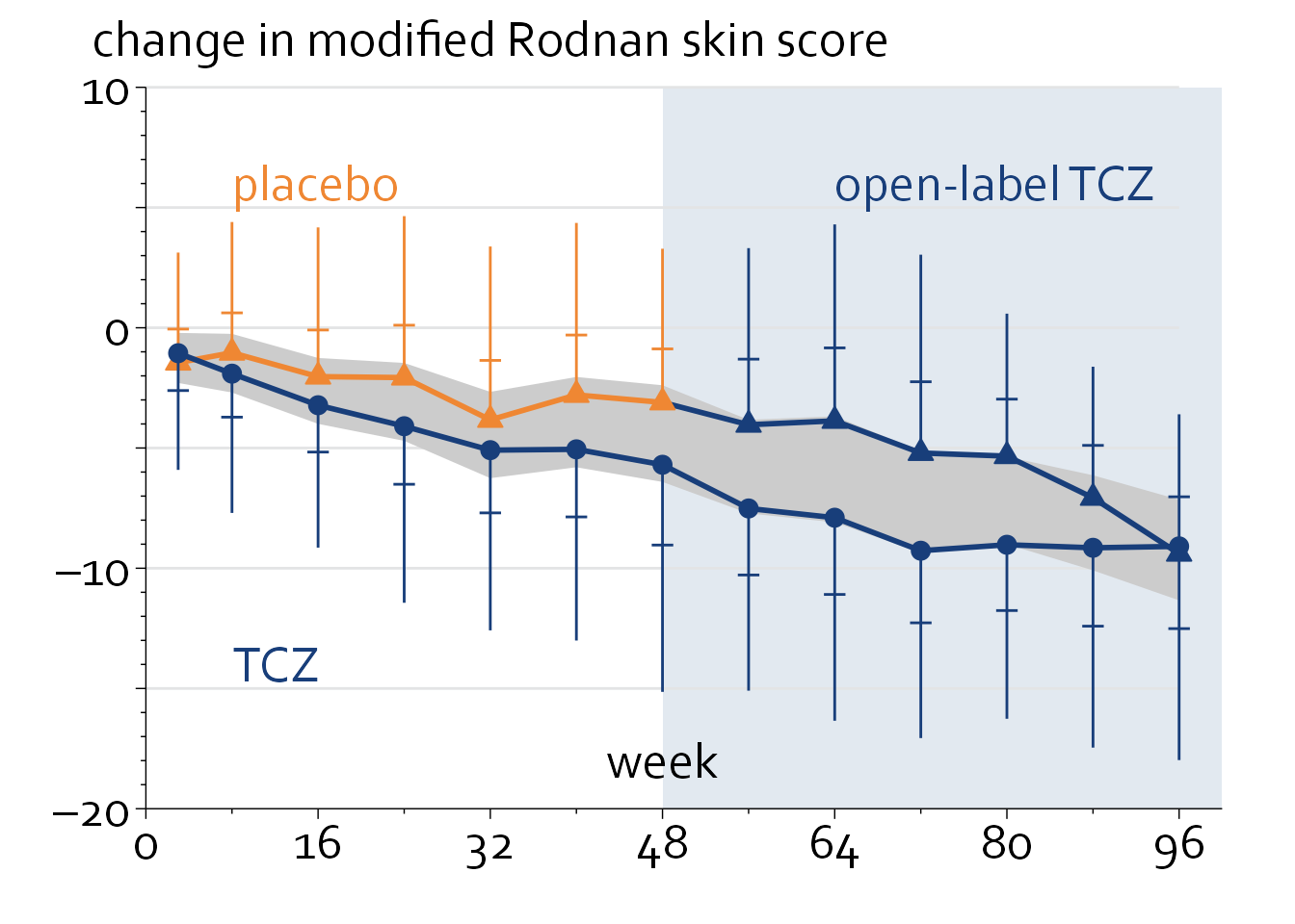
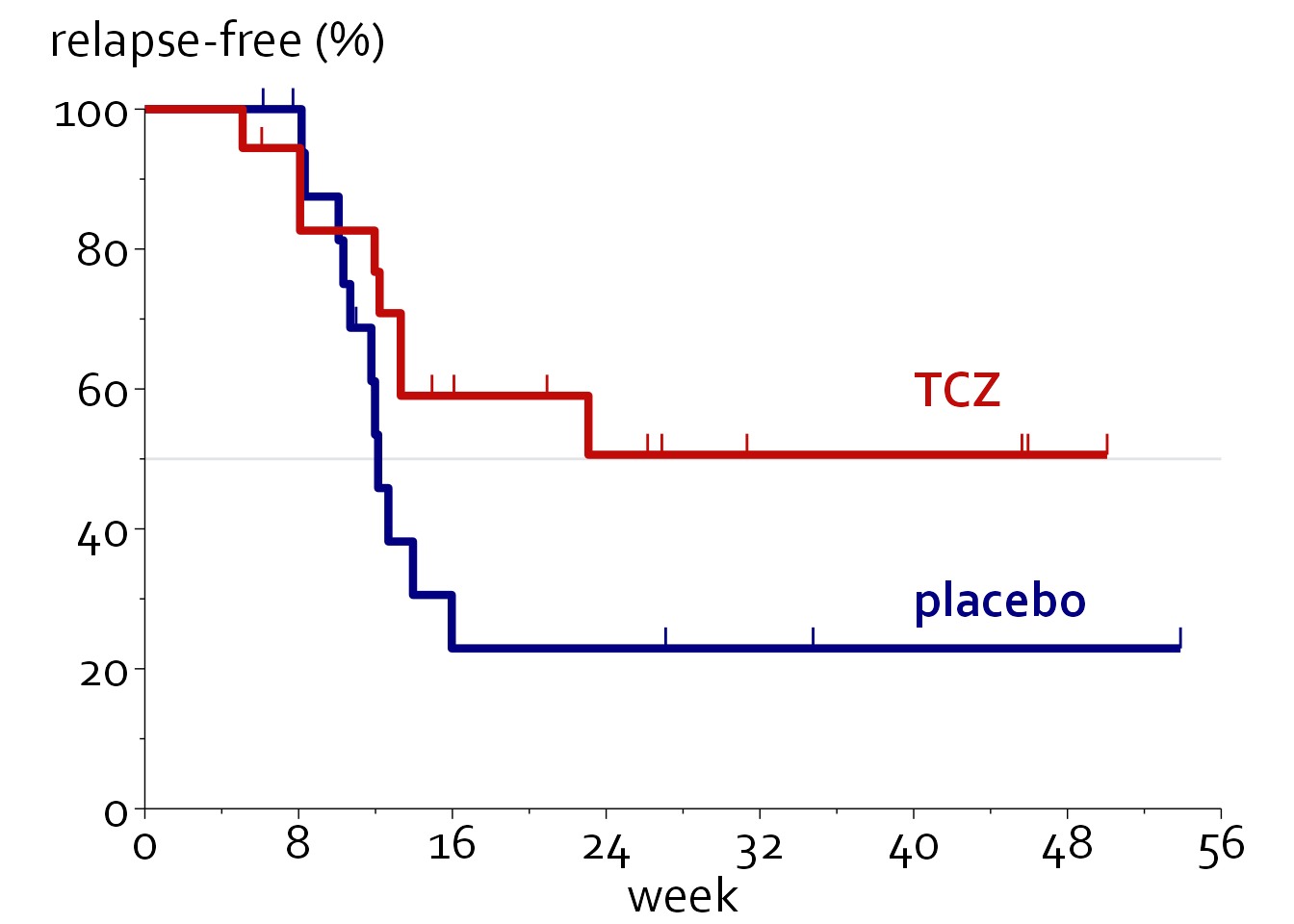
Survival graphs
First, we will load in some data.
Loading required package: ggpubr
Attaching package: 'survival'The following object is masked from 'package:survminer':
myelomasurvival_data <- readxl::read_excel("Data/boers.xlsx", sheet = "survival (5)")
knitr::kable(head(survival_data, n=10))| time | event | treat |
|---|---|---|
| 5.087 | 1 | TCZ |
| 8.076 | 1 | TCZ |
| 8.076 | 1 | TCZ |
| 11.956 | 1 | TCZ |
| 12.213 | 1 | TCZ |
| 13.315 | 1 | TCZ |
| 13.315 | 1 | TCZ |
| 23.078 | 1 | TCZ |
| 6.080 | 0 | TCZ |
| 14.939 | 0 | TCZ |
km_data <- surv_summary(survfit(Surv(time,event) ~ treat, data=survival_data), data=survival_data)
km_data <- rbind(data.frame("time"=c(0,0),"n.risk"=c(18,18),"n.event"=c(0,0),
                            "n.censor"=c(0,0), "surv"=c(1,1),"std.err"=c(0,0),
                            "upper"=c(1,1),"lower"=c(1,1),
                            "strata"=c("treat=placebo", "treat=TCZ"),
                            "treat"=c("placebo","TCZ")), km_data)
km_data$col <- with(km_data, ifelse(treat=="placebo","#020080", "#C00B08"))

censor_data <- subset(km_data, n.censor>0)
theme_boers <- function(){
theme(text=element_text(family="Corbel", colour="black"),
#define font
plot.margin = margin(0.2,1,0,0,"cm"),
#prevent x axis labels from being cut off
plot.title = element_text(size=20),
#text size of the title
panel.grid.major = element_blank(),
panel.grid.minor = element_blank(),
#we do not want automatic grid lines in the background
axis.text.x=element_text(size=20, colour="black"),
axis.text.y=element_text(size=20, colour="black"),
axis.title.x = element_text(size=20),
axis.title.y = element_text(size=20),
#define the size of the tick labels and axis titles
axis.line = element_line(colour = 'black', linewidth = 0.25),
axis.ticks = element_line(colour = "black", linewidth = 0.25),
#specify thin axes
axis.ticks.length = unit(4, "pt"),
axis.minor.ticks.length = unit(2, "pt"))
#minor ticks should be shorter than major ticks
}ggplot(data=km_data, aes(time, 100*surv, colour=col)) + theme_minimal() + theme_boers() +
annotate(geom="segment", x=0, xend=56, y=50,
yend=50, col="#E3E4E5") +
coord_cartesian(xlim=c(0,56), ylim=c(0,100), clip = "off") +
geom_step(linewidth=1.5) +
scale_color_identity() +
geom_segment(data=censor_data,
aes(x=time, xend=time, y=100*surv, yend=100*(surv+0.03),colour=col)) +
scale_y_continuous(breaks=seq(0,100,by=20),
labels=seq(0,100,by=20),
minor_breaks = seq(0,100,by=10),
expand = c(0,0)) +
scale_x_continuous(breaks=seq(0,56,by=8),
labels=seq(0,56,by=8),
minor_breaks = seq(0,56,by=4),
expand = c(0,0)) +
annotate("text", -5, 110, label="relapse-free (%)", size=20/.pt, hjust=0, family="Corbel") +
annotate("text", 40, 60, label="TCZ", colour="#C00B08", fontface=2,
size=20/.pt, hjust=0, family="Corbel") +
annotate("text", 40, 30, label="placebo", colour="#020080", fontface=2,
size=20/.pt, hjust=0, family="Corbel") +
guides(y = guide_axis(minor.ticks = TRUE), x=guide_axis(minor.ticks = TRUE)) +
theme(plot.margin=margin(1.5,1,0,0,"cm")) +
xlab("week") + ylab("")