library(rms)
library(survival)
library(tidyverse)
library(ggplot2)

set.seed(1)

extrafont::loadfonts(quiet = TRUE)
knitr::opts_chunk$set(dev = "ragg_png")


theme_boers <- function(){
theme(text=element_text(family="Corbel", colour="black"),
      plot.title = element_text(size=20),
      panel.grid.major = element_blank(),
      panel.grid.minor = element_blank(),
      axis.text.x=element_text(size=20, colour="black"),
      axis.text.y=element_text(size=20, colour="black"),
      axis.title.x = element_text(size=20),
      axis.title.y = element_text(size=20),
      axis.line = element_line(colour = 'black', linewidth = 0.25),
      axis.ticks = element_line(colour = "black", linewidth = 0.25),
      axis.ticks.length = unit(4, "pt"),
      axis.minor.ticks.length = unit(2, "pt"))
}

x <- seq(0, 10, by=0.1)
y <- 4 * sin(x) + 1.5*x + rnorm(101, mean = 0, sd = 1)
y <- ifelse(y<0, 0, y)Investigating and visualizing nonlinearity
An implicit assumption in regression models is that the association of a predictor with the outcome is linear. However, this is more frequently the exception than the rule.
Investigating nonlinearity is important for several reasons:
- Confounder adjustment: adjusting for continuous confounders with a linear term, while the true confounder-outcome relationship is nonlinear, will result in residual confounding. Essentially, we are adjusting for confounders in a suboptimal way.
- Prediction models: missing a nonlinear predictor-outcome relationship will result in underestimation of the predictive performance of that variable (e.g., P values that are too high), and can result in over- or underestimating the true outcome risk (i.e., ‘miscalibration’).
Simple example
We will start with a simple example.
gg_dat <- data.frame("x"=x, "y"=y)
bg_line_dat <- data.frame("x"=rep(0,4), "xend"=rep(10.5,4),
                   "y"=seq(5,20,by=5), "yend"=seq(5,20,by=5))

gg <- ggplot(data=gg_dat, aes(x,y)) + theme_minimal() + theme_boers() +
  geom_segment(data=bg_line_dat, aes(x=x, xend=xend,
                   y=y, yend=yend),
               col="#e3e4e5") +
  geom_point(aes(x,y), size=0.5, colour="#374e55") +
  #geom_smooth(method="gam", formula = y ~ s(x, bs = "cs")) +
  scale_x_continuous(breaks=seq(0,10,by=2),
                     labels=seq(0,10,by=2),
                     minor_breaks = seq(0,10,by=1),
                     expand = c(0,0)) +
    scale_y_continuous(breaks=seq(0,20,by=5),
                     labels=seq(0,20,by=5),
                     minor_breaks = seq(0,20,by=1),
                     expand = c(0,0)) +
  guides(x = guide_axis(minor.ticks = TRUE),
    y = guide_axis(minor.ticks = TRUE)) +
  coord_cartesian(xlim=c(0,10.5), ylim=c(0,20), clip = "off") +
  xlab("x") + ylab("y")

gg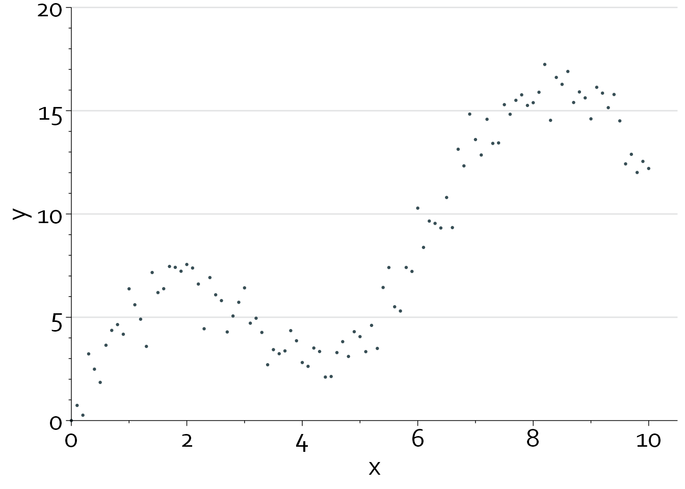
Clearly, the relationship between x and y is highly nonlinear.
gg + geom_smooth(method="lm", colour="#00a1d5", fill="#00a1d530")`geom_smooth()` using formula = 'y ~ x'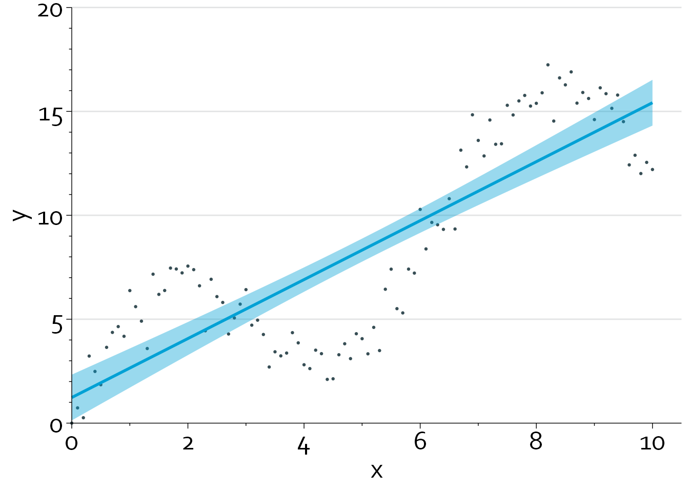
There are multiple methods for dealing with nonlinearity:
- Categorizing a continuous variable.
- Clinical interpretability. Imagine that we would divide age into <65 and ≥65 years.
- Using polynomials (e.g., x and x2)
- Using multivariable fractional polynomials (mfp/mfp2 package) or restricted cubic splines (Hmisc/rms package)
#ols(y ~ rcs(x,3)) #2 df
#ols(y ~ rcs(x,4)) #3 df
#ols(y ~ rcs(x,5)) #4 df

gg +
  geom_smooth(method="lm", formula=y~x,
                 colour="#374e55", fill="#374e5510") +
  geom_smooth(method="lm", formula=y~rcs(x,3),
                 colour="#6a6599", fill="#6a659910") +
  geom_smooth(method="lm", formula=y~rcs(x,4),
                 colour="#df8f44", fill="#df8f44") +
  geom_smooth(method="lm", formula=y~rcs(x,5),
                 colour="#00a1d5", fill="#00a1d510")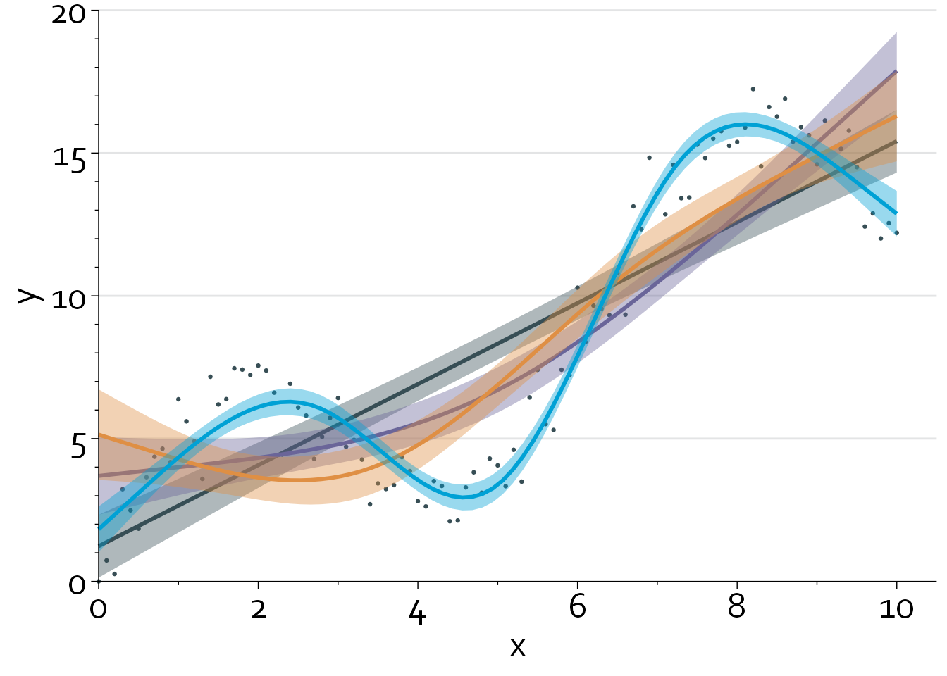
A linear regression model that models x using a restricted cubic spline with 5 knots (blue line) produces the best fit, with an adjusted R2 of 0.95. Note that we can also perform a formal nonlinearity test to assess how much evidence there is against a linear relationship between x and y.
                Analysis of Variance          Response: y

 Factor     d.f. Partial SS MS         F      P
 x           4   2397.8377  599.459427 517.00 <.0001
  Nonlinear  3    670.2640  223.421345 192.69 <.0001
 REGRESSION  4   2397.8377  599.459427 517.00 <.0001
 ERROR      96    111.3126    1.159506
The P value
Important
Nonlinearity tests are always dependent on the scale that x is modeled on. Let’s say, for instance, that the true relationship between x and y is logarithmic:
x <- seq(0, 10, length.out=200)
y <- 7*(log(x + 1) + rnorm(200, mean=0, sd=0.2))
y <- ifelse(y<0, 0, y)

gg_dat <- data.frame("x"=x, "y"=y)

gg %+% gg_dat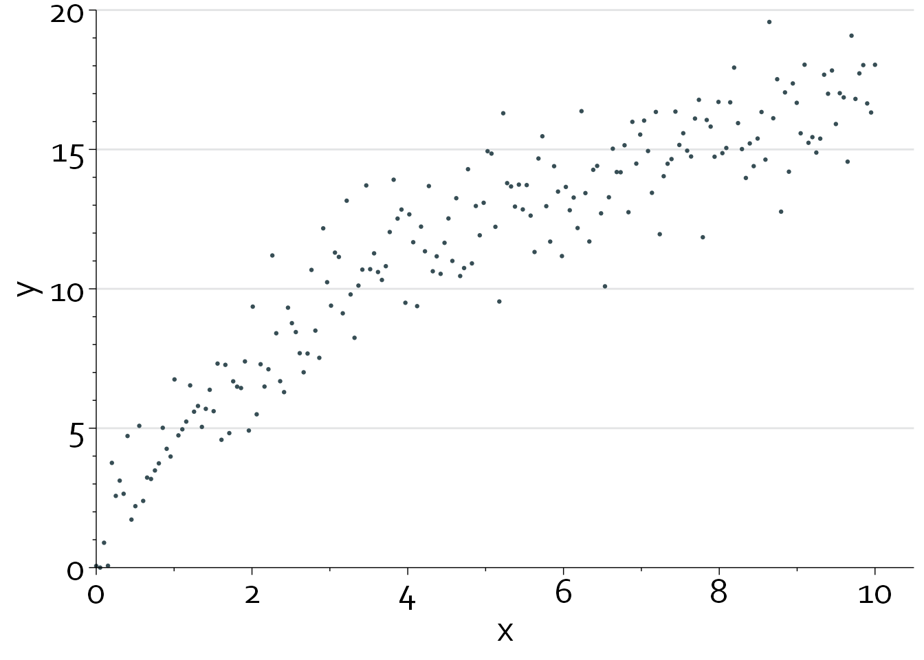
In this case, the nonlinearity test is highly significant if we model x on its original scale (Pnonlinearity <0.0001).
                Analysis of Variance          Response: y

 Factor     d.f. Partial SS MS          F      P
 x            2  3680.5703  1840.285131 884.64 <.0001
  Nonlinear   1   217.9359   217.935890 104.76 <.0001
 REGRESSION   2  3680.5703  1840.285131 884.64 <.0001
 ERROR      197   409.8136     2.080272
However, after log-transformation, there is no evidence for ‘extra’ nonlinearity (Pnonlinearity=0.85). In essence, we have already sufficiently captured the nonlinear relationship between x and y through the log-transformation.
                Analysis of Variance          Response: y

 Factor     d.f. Partial SS MS          F      P
 x            2  3706.68423 1853.342117 951.55 <.0001
  Nonlinear   1     1.52654    1.526540   0.78 0.3771
 REGRESSION   2  3706.68423 1853.342117 951.55 <.0001
 ERROR      197   383.69967    1.947714
As such, it is sometimes possible to simplify a regression model by approximating a restricted cubic spline function with, e.g., a spline function.
Prediction models and degrees of freedom
Modeling with restricted cubic splines increases the number of parameters in a model. This is particularly important for clinical prediction models, as sample size calculations require the investigator to fill in the number of candidate parameters that are considered when developing the model.
In practice, it is important to consider how many degrees of freedom you want to spend on modeling a predictor. Predictors that are known (based on prior knowledge) to have nonlinear associations with the outcome or strong predictors can be modeled with extra knots.
Number of knots and knot placement
In general, depending on the effective sample size, 3 to (max.) 5 knots are sufficient to capture nonlinearity. Results are quite insensitive to the placement of knots.
Logistic and Cox regression models
In terms of R code, investigating nonlinear covariate-outcome relationships in logistic regression models and Cox regression models is very similar. A major difference is that we don’t know the ‘true outcome’, as the true risk of a patient to have a certain outcome is by definition subject to aleatory uncertainty. In contrast, in linear regression models, the outcome is typically directly observable.
First, we use rcs() to use restricted cubic splines, and subsequently use the anova() function to perform nonlinearity tests.
gbsg <- survival::gbsg
cph_nonlin <- cph(Surv(rfstime, status) ~
rcs(pgr,4),
data=gbsg, x=TRUE, y=TRUE)
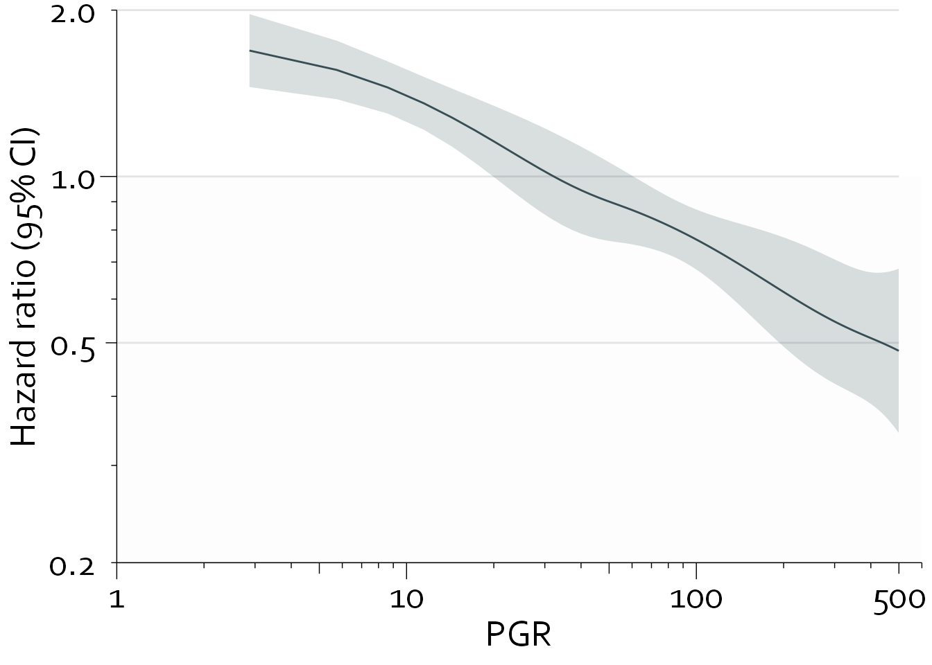
anova(cph_nonlin, test="LR") Likelihood Ratio Statistics Response: Surv(rfstime, status)
Factor Chi-Square d.f. P
pgr 53.35 3 <.0001
Nonlinear 19.31 2 1e-04
TOTAL 53.35 3 <.0001Note that roughly 40% (19.31/53.35) of the prognostic information provided by pgr is due to the nonlinear relationship between pgr and recurrence-free survival, with a Pnonlinearity of <0.0001.
pgr_dat <- Predict(cph_nonlin, pgr, fun=exp, np=300)
pgr_dat <- subset(pgr_dat, pgr>0 & pgr<500)
pgr_dat <- as.data.frame(pgr_dat)

bg_line_dat <- data.frame("x"=rep(1,4), "xend"=rep(500,4),
                   "y"=c(0.2,0.5,1,2), "yend"=c(0.2,0.5,1,2))

gg <- ggplot(data=pgr_dat, aes(x=pgr,y=yhat)) +
  theme_minimal() + theme_boers() +
  annotate("rect", xmin=1, xmax=600, ymin=0.2, ymax=1, fill="#e3e4e510") +
  geom_segment(data=bg_line_dat, aes(x=x, xend=xend,
                   y=y, yend=yend),
               col="#e3e4e5") +
  geom_line(col="#374e55") +
  geom_ribbon(aes(ymin=lower, ymax=upper), fill="#374e5530") +
  scale_x_continuous(breaks=c(1,10,100,500),
                     labels=c(1,10,100,500),
                     trans="log",
                     expand = c(0,0)) +
    scale_y_continuous(breaks=c(0.2,0.5,1,2),
                     labels=c("0.2", "0.5", "1.0", "2.0"),
                     trans="log",
                     expand = c(0,0)) +
    guides(x = "axis_logticks", y = "axis_logticks") +
  coord_cartesian(xlim=c(1,600), ylim=c(0.2, 2), clip = "off") +
  xlab("PGR") + ylab("Hazard ratio (95% CI)")

gg