Distributions and statistical summaries
Scatterplots
Loading required package: viridisLitelibrary(hexbin)
library(readxl)
data_scatter <- read_excel("Data/boers.xlsx",
sheet = "cost")
knitr::kable(head(data_scatter, n=10))| effect_estimate | cost_difference |
|---|---|
| -0.0568106 | 3494.0100 |
| 0.0420845 | 2654.0160 |
| 0.1269841 | 1640.5620 |
| -0.0721241 | 4220.2970 |
| -0.0123457 | 701.9741 |
| 0.1310209 | 2807.7400 |
| -0.0582604 | 4950.1570 |
| -0.0382767 | 1762.8970 |
| 0.0436508 | 3699.0660 |
| 0.1767901 | 1814.7750 |
theme_boers <- function(){
theme(text=element_text(family="Corbel", colour="black"),
      #define font
      plot.margin = margin(0.2,1,0,0,"cm"),
      #prevent x axis labels from being cut off
      plot.title = element_text(size=20),
      #text size of the title
      panel.grid.major = element_blank(),
      panel.grid.minor = element_blank(),
      #we do not want automatic grid lines in the background
      axis.text.x=element_text(size=20, colour="black"),
      axis.text.y=element_text(size=20, colour="black"),
      axis.title.x = element_text(size=20),
      axis.title.y = element_text(size=20),
      #define the size of the tick labels and axis titles
      axis.line = element_line(colour = 'black', linewidth = 0.25),
      axis.ticks = element_line(colour = "black", linewidth = 0.25),
      #specify thin axes
      axis.ticks.length = unit(4, "pt"),
      axis.minor.ticks.length = unit(2, "pt"))
  #minor ticks should be shorter than major ticks
}ggplot(data=data_scatter, aes(x=effect_estimate, y=cost_difference)) +
geom_point()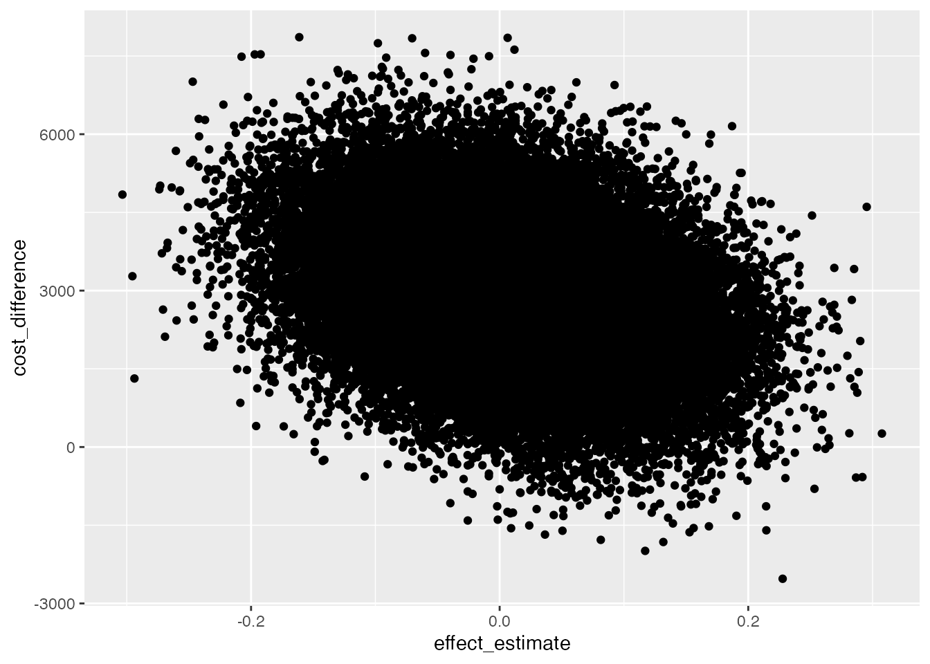
One solution could be to make all points more translucent and smaller.
ggplot(data=data_scatter, aes(x=effect_estimate, y=cost_difference)) +
  theme_minimal() + theme_boers() +
    annotate(geom="segment", x=-0.4, xend=0.4, y=0, yend=0, col="#E3E4E5") +
  annotate(geom="segment", x=0, xend=0, y=-4000, yend=8000, col="#E3E4E5") +
   coord_cartesian(xlim=c(-0.4,0.4), ylim=c(-4000,8000), clip = "off") +
  geom_point(alpha=0.1, size=0.1) +
  scale_x_continuous(breaks=seq(-0.4,0.4,by=0.2),
                       labels=c("–0.4", "–0.2", "0", 0.2, 0.4),
                       minor_breaks = seq(-0.4,0.4,by=0.1),
                       expand = c(0,0)) +
  scale_y_continuous(breaks=seq(-4000,8000,by=2000),
                       labels=c("–4000","–2000",0,2000,4000,6000,8000),
                     minor_breaks = seq(-4000,8000,by=1000),
                       expand = c(0,0)) +
  guides(y = guide_axis(minor.ticks = TRUE), x=guide_axis(minor.ticks = TRUE)) +
  theme(plot.margin=margin(1.5,1,0,0,"cm")) +
  xlab("effect estimate") + ylab("")
Alternatively, we could only plot 10% of the data (randomly chosen) and make all points smaller.
data_scatter$choose <- rbinom(nrow(data_scatter),1,0.1)
ggplot(data=subset(data_scatter, choose==1), aes(x=effect_estimate, y=cost_difference)) +
  theme_minimal() + theme_boers() +
    annotate(geom="segment", x=-0.4, xend=0.4, y=0, yend=0, col="#E3E4E5") +
  annotate(geom="segment", x=0, xend=0, y=-4000, yend=8000, col="#E3E4E5") +
   coord_cartesian(xlim=c(-0.4,0.4), ylim=c(-4000,8000), clip = "off") +
  geom_point(size=0.2) +
  scale_x_continuous(breaks=seq(-0.4,0.4,by=0.2),
                       labels=c("–0.4", "–0.2", "0", 0.2, 0.4),
                       minor_breaks = seq(-0.4,0.4,by=0.1),
                       expand = c(0,0)) +
  scale_y_continuous(breaks=seq(-4000,8000,by=2000),
                       labels=c("–4000","–2000",0,2000,4000,6000,8000),
                     minor_breaks = seq(-4000,8000,by=1000),
                       expand = c(0,0)) +
  guides(y = guide_axis(minor.ticks = TRUE), x=guide_axis(minor.ticks = TRUE)) +
  theme(plot.margin=margin(1.5,1,0,0,"cm")) +
  xlab("effect estimate") + ylab("")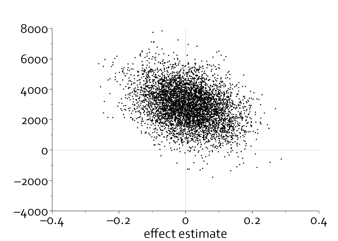
We could also plot a two-dimensional density plot, in which the intensity of the color is used to denote the density.
ggplot(data=data_scatter, aes(x=effect_estimate, y=cost_difference)) +
  theme_minimal() + theme_boers() +
    annotate(geom="segment", x=-0.4, xend=0.4, y=0, yend=0, col="#E3E4E5") +
  annotate(geom="segment", x=0, xend=0, y=-4000, yend=8000, col="#E3E4E5") +
   coord_cartesian(xlim=c(-0.4,0.4), ylim=c(-4000,8000), clip = "off") +
  geom_hex(bins=100) +
  viridis::scale_fill_viridis(option = "A") +
  scale_x_continuous(breaks=seq(-0.4,0.4,by=0.2),
                       labels=c("–0.4", "–0.2", "0", 0.2, 0.4),
                       minor_breaks = seq(-0.4,0.4,by=0.1),
                       expand = c(0,0)) +
  scale_y_continuous(breaks=seq(-4000,8000,by=2000),
                       labels=c("–4000","–2000",0,2000,4000,6000,8000),
                     minor_breaks = seq(-4000,8000,by=1000),
                       expand = c(0,0)) +
  guides(y = guide_axis(minor.ticks = TRUE), x=guide_axis(minor.ticks = TRUE)) +
  theme(plot.margin=margin(1.5,1,0,0,"cm")) +
  xlab("effect estimate") + ylab("")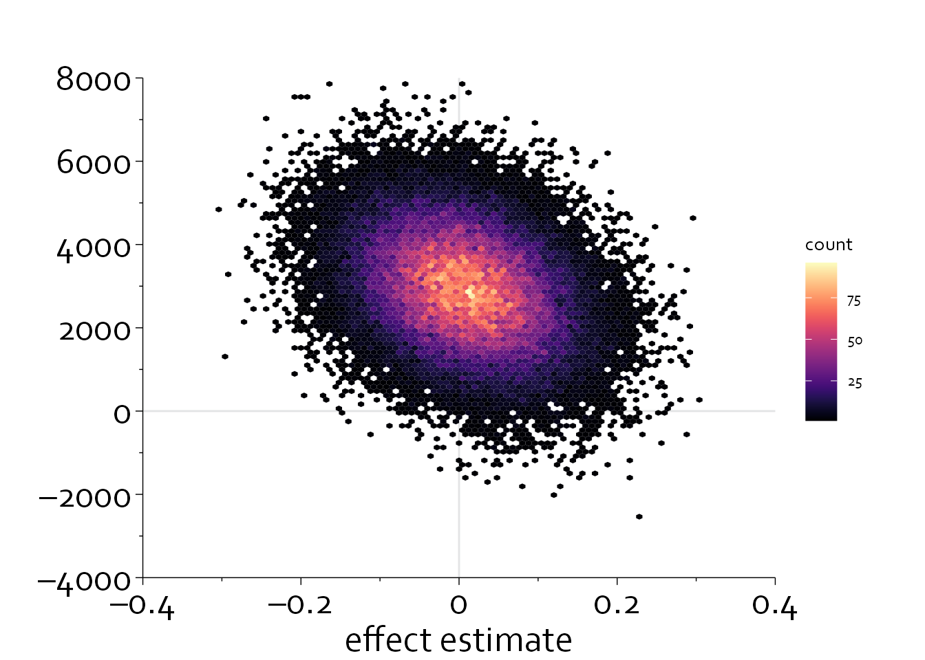
Box plots and violin plots
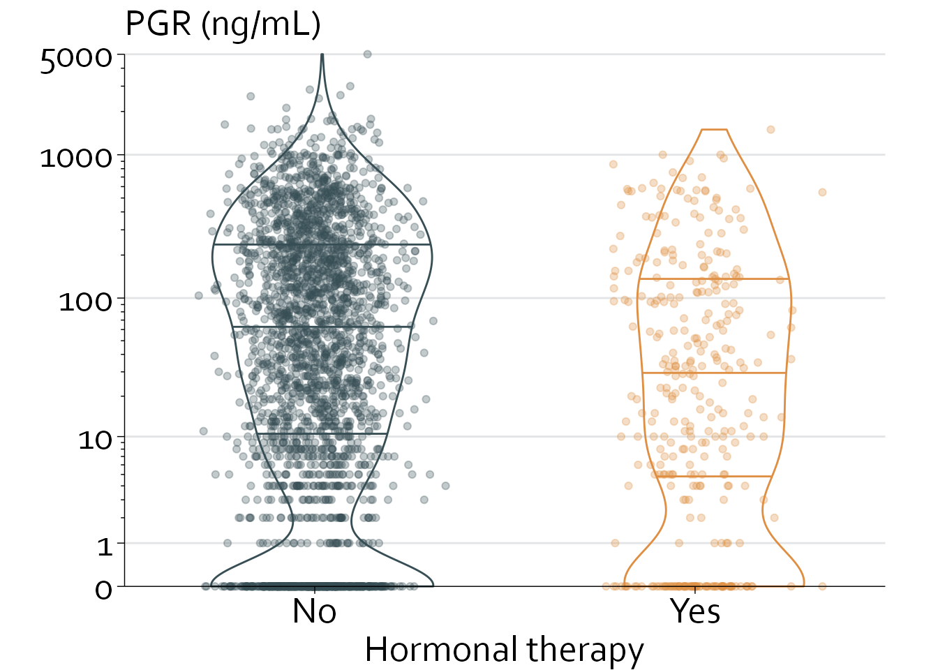
In this chapter, we will use data from 2982 patients with primary breast cancer who were included in the Rotterdam tumor bank, of whom 339 were treated with hormonal therapy. In later chapters, we will analyse these data to assess whether hormonal therapy is associated with longer recurrence-free survival.
For brevity’s sake, however, we will focus on assessing to what extent the expression of progesterone receptors (PGR) is different between patients who were treated with vs without hormonal therapy.
We will start with loading the data.
| pid | year | age | meno | size | grade | nodes | pgr | er | hormon | chemo | rtime | recur | dtime | death |
|---|---|---|---|---|---|---|---|---|---|---|---|---|---|---|
| 1 | 1986 | 54 | 1 | <=20 | 2 | 0 | 1360 | 149 | 0 | 0 | 4738 | 0 | 4738 | 0 |
| 2 | 1990 | 55 | 1 | 20-50 | 2 | 0 | 763 | 763 | 0 | 0 | 3208 | 0 | 3208 | 0 |
| 3 | 1988 | 34 | 0 | <=20 | 2 | 0 | 113 | 109 | 0 | 0 | 3438 | 0 | 3438 | 0 |
| 4 | 1990 | 42 | 1 | <=20 | 2 | 0 | 465 | 79 | 0 | 0 | 3825 | 0 | 3825 | 0 |
| 5 | 1989 | 35 | 0 | <=20 | 2 | 0 | 82 | 25 | 0 | 0 | 3781 | 0 | 3781 | 0 |
| 6 | 1987 | 50 | 1 | <=20 | 2 | 0 | 75 | 10 | 0 | 0 | 3319 | 0 | 3988 | 1 |
| 7 | 1989 | 46 | 1 | <=20 | 2 | 0 | 174 | 56 | 0 | 0 | 3727 | 0 | 3727 | 0 |
| 8 | 1993 | 40 | 0 | <=20 | 2 | 0 | 0 | 2 | 0 | 0 | 2981 | 1 | 2988 | 0 |
| 9 | 1984 | 36 | 0 | <=20 | 2 | 0 | 43 | 23 | 0 | 0 | 4112 | 0 | 4112 | 0 |
| 10 | 1989 | 42 | 0 | <=20 | 2 | 0 | 462 | 75 | 0 | 0 | 3571 | 0 | 3571 | 0 |
25% 50% 75%
5 46 208 25% 50% 75%
1 19 115 with(rott, kruskal.test(pgr ~ hormon))
    Kruskal-Wallis rank sum test

data:  pgr by hormon
Kruskal-Wallis chi-squared = 21.066, df = 1, p-value = 4.438e-06
The PGR level is significantly higher in patients who were not treated with hormonal therapy (median [IQR], 46 [5 to 208] vs 19 [1 to 115]; P<.0001).
Let’s plot this in a histogram (showing a very right-skewed distribution), and afterwards in a univariate scatterplot that is stratified by receipt of hormonal therapy.
rott$hormon <- as.factor(rott$hormon)

ggplot(data=rott, aes(pgr, after_stat(density), colour=hormon)) + geom_histogram()
`stat_bin()` using `bins = 30`. Pick better value with `binwidth`.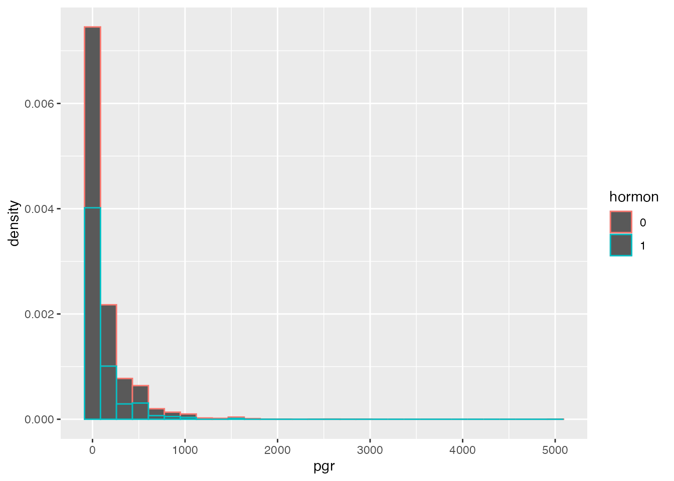
ggplot(data=rott, aes(hormon, y=pgr)) + geom_boxplot() + geom_jitter(width=0.2)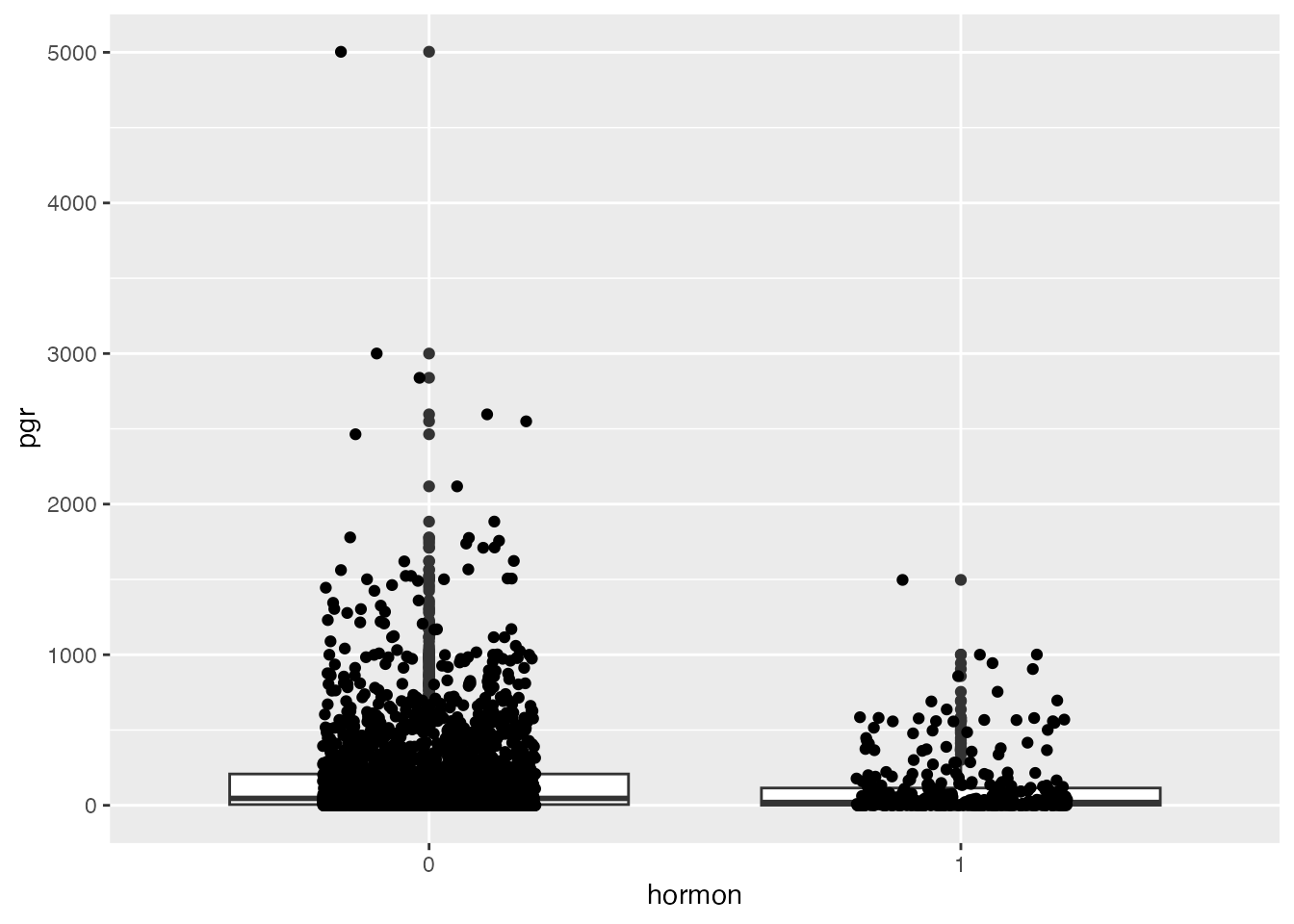
We will continue with improving the univariate scatterplot.
ggplot(data=rott, aes(hormon, y=pgr)) + theme_minimal() + theme_boers() +
  geom_boxplot() + geom_jitter(width=0.2)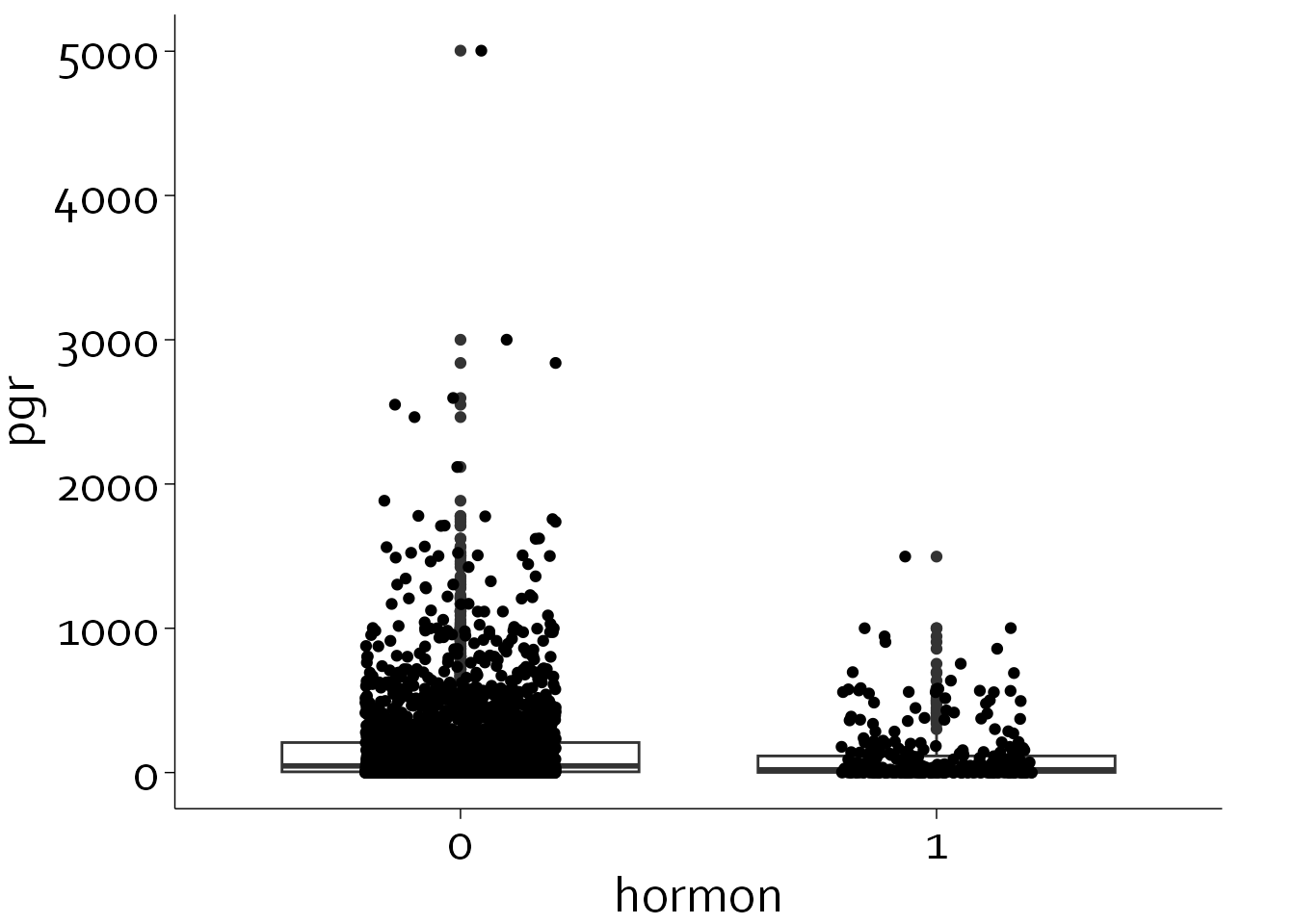
This is slightly better, but there are still several glaring issues that need to be solved:
- PGR is extremely right-skewed, leading to a lot of clumping and overlap around y=0 to y=500
- A simple log-transformation will not work, as some patients have a PGR level of 0. However, we do need a logarithmic y axis and tick marks
- The data points overshadow the box plot
- Preferably, we would like some reference lines in the background
- The univariate scatter overlaps with the ‘outliers’ of the boxplot (i.e., extreme values are getting plotted twice
- We could use a violin plot (specifying the 25th, 50th, and 75th percentile) instead of a box plot.
rott$col <- with(rott, ifelse(hormon==0, "#374e55", "#df8f44"))

rott$x <- with(rott, ifelse(hormon==0, 0.5+rnorm(2649,0,0.1),
                            ifelse(hormon==1, 1.5+rnorm(339,0,0.1), NA)))

ggplot(data=rott, aes(x=x, y=pgr)) + theme_minimal() + theme_boers() +
  annotate(geom="segment", x=0, xend=2, y=c(1,10,100,1000,5000),
             yend=c(1,10,100,1000,5000), col="#E3E4E5") +
  #reference lines
    geom_violin(aes(group=hormon, col=col),
                draw_quantiles = c(0.25,0.5,0.75), fill=NA,
                position = position_dodge(width = 0.01)) +
  #violin plot
  geom_point(aes(col=col), alpha=0.30) +
  #plot data points
  coord_cartesian(xlim=c(0,2), ylim=c(0,5000), clip = "off") +
  #specify range of x and y
  scale_y_continuous(breaks=c(0,1,10,100,1000,5000),
                       labels=c(0,1,10,100,1000,5000),
                       minor_breaks = c(rep(seq(1,9,by=1), times=3) *
                       10^rep(seq(0,2,by=1), each=9), 2000, 3000, 4000),
                       expand = c(0,0),
                     trans="log1p") +
  #specify minor breaks at 1,2,3...10,20,30...,100,200,300...
  scale_x_continuous(breaks=c(0.5,1.5),
                       labels=c("No", "Yes"),
                       expand = c(0,0)) +
  guides(y = guide_axis(minor.ticks = TRUE)) +
  #only specify minor ticks for the y axis
  scale_colour_identity() +
    xlab("Hormonal therapy") + ylab("") + labs(title="PGR (ng/mL)")